Don't Color Me Gone: The Science of Making Drones Visible or Invisible

The August 1992 issue of Model Airplane News included an article by Dr. Robert Suding that addressed the science of maintaining the visibility of an RC model while in flight. The 3-page article is based on the science of color and human vision. The flip side of maximizing model visibility is rendering drones nearly invisible—the science can be used for either purpose. The photos graphically illustrate the points made by Dr. Suding and are posted in the numbered order as they appear in the text. --Tom Atwood, NREF Editor-in-Chief
Don’t Color Me Gone
How to paint your airplane so you can still see it while flying
By Dr. Robert Suding
All R/C fliers have gotten that "I can't tell which way it's going" feeling when learning to fly R/C. Several simple color trimming steps can help you fly your airplane better, whether you are a beginner or top dog in Pattern.
Most planes, especially ARFs, are covered or painted to look good in the store or pits. But in the air it's a different story. The situation is very simple: If you can't see it, you can't fly it.
To successfully fly an R/C aircraft, the pilot must have good orientation and distance perception. The human eye/brain estimates aircraft orientation based on the perceived position of the model's outer edges, and the relationship of these outer edges to the edges of any discernible trim markings on the plane's wings or fuselage. Distance perception, in turn, depends on a combination of one's perception of the aircraft's outside edges and its estimated orientation.
After you have located your airplane and estimated how far away it is, you must immediately recognize several attitude orientations:
Is it flying toward me or away from me?
Is it upright or inverted?
Are the wings flat, vertical, or tipped?
Is it flying horizontal, upward or downward?
Is it flying parallel to the runway or vectored?
Is it flying perfectly vertical or skewed sideways or fore/aft?
The following suggestions will help you with distance and attitude perception. Visual acuity and contrast perception diminish with age, but by using correct color concepts, even senior fliers will find that visual orientation of their aircraft can be consistently and reliably achieved.
Solid-Colored Aircraft
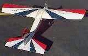
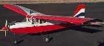
R/C airplanes are flown in all kinds of weather and background conditions. A solid-colored aircraft will sooner or later fly into a condition where it blends into the background, resulting in a complete loss of location and orientation since no edges can be perceived. The absolute worst, in my opinion, is a silver Mustang in a heavily overcast sky. Yellow cubs are tough to see when back lit by the sun. I had a dark green plane that would disappear when I landed with a background of green trees. Red and dark blue planes go invisible in late evening and storm conditions. A solid colored airplane is easier to cover, but it won't do you any favors up in the sky.
Wing & Horizontal Stabilizer Shades
The top of the wing and horizontal stabilizer is normally lit by sunlight. The bottom of the wing and horizontal stabilizer is shadowed. Coloring the top lighter and the bottom darker keeps this same relationship even in changing lighting conditions.
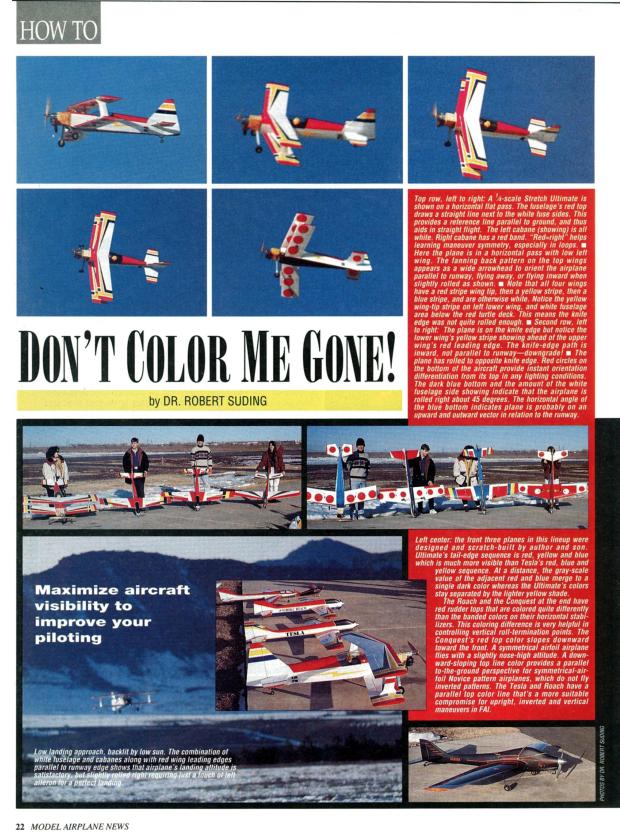
Photos 1. & 2.
ARFs are classic blunders in coloring. Either they have identical top & bottom wing colors, or they put some token color on the top of the wings and leave them white underneath. They look good in the store, but don't help the beginner at all. I always recommend that beginners cover the bottom of the wing and the bottom of the horizontal stabilizer with dark blue contact paper before the next flight.
When flying at a distance of 500 feet or more (depending on the size of the model and lighting conditions) you can't see colors, because the cones of your eyes that do the color perception are 2,000 times less sensitive than the rods, which perceive illumination. In these circumstances, your gray-scale vision (your perception of lightness and darkness in a black-and-white image) provides your orientation and depth perception, not color. Any series of adjacent colors on your aircraft that are intended to facilitate orientation should therefore be gray-scale opposites. For example, a series of bands consisting of red, yellow, blue, and then white is desirable. Don't assume a series of "color opposites" such as red, green, blue and black will be effective These all have the same dark gray-scale shade and will show an equal tendency to disappear in a deep blue or heavily overcast sky.
If you use the wrong series of color bands, you won't know how far away your aircraft is, and you won't even know which way it's heading to bring it back. Also, don't rely on intricate patterns. They blend together to form edge-less fuzz approximately 100 feet away. You can test potential color schemes for gray-scale perceptibility by video taping and playing back alternative color schemes on a black & white TV or on a color TV with the color control turned down.
Actual Patterns to Use
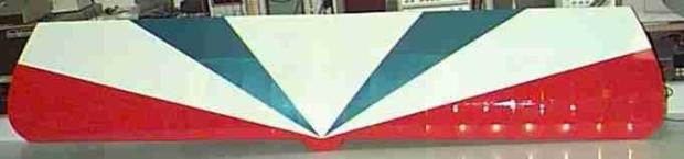
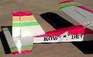
The best color scheme for beginners that I have found is a combination of large starburst patterns on top of the wing and horizontal stabilizer, and a solid dark color underneath the wing and horizontal stabilizer.
Photo 3.
Beginners consistently become perceptually disorientated when flying at a distance, especially when the airplane flies at a 45 degree angle away or towards the pilot, since the aircraft silhouette is identical. With the starburst pattern, all the beginner has to do is slightly roll the wings towards himself, and the starburst pattern becomes an arrowhead, pointing in or out, the direction of flight.
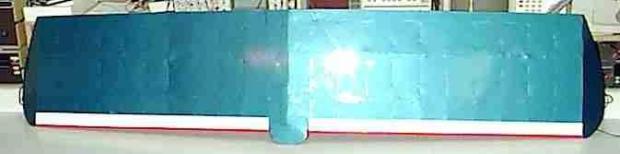
Start by covering the bottom of the wing and horizontal stabilizer with any dark color. The exact color could be black, deep red, dark blue, or green, it doesn't matter; they will be the same gray-scale color at a distance. Then put a 2" strip of some light color along the leading edge of the bottom. Do the same for the bottom of the horizontal stabilizer, only making the light strip about 1" wide.
Photo 4.
The base color of the top of the wing must be a very light color such as white, yellow or some other very light color The starburst pattern starts out at the center of the wing, from 3/8" under the wing leading edge to about 1" back from the leading edge at the top. Then it is a large "pie slice" to the wing tip, where it extends from 3/8" under the wing leading edge to the trailing edge on the top. A second pie slice of a different dark color extends from the center of the wing to points 1/3 and 2/3s out on the wing. Both sides of the wing are colored like this as is the top of the horizontal stabilizer.
Landing Considerations
Landing requires keeping your wings flat and knowing where you are in the landing approach. You are generally close to the airplane during the later stages of the landing approach, so your color perception is improved, but the wings will be edge on to your line of sight. The leading edges should be should be very prominent against any background such as blue sky, white clouds, dark overcast, distant mountains, or green trees. All of these items have spectral lines toward the higher frequency blue or green region, so a very simple solution would be to have a low frequency color such as red or orange on your wing and horizontal stabilizer leading edge. At the field that I fly at in Colorado, ARFs with blue wing edges are almost invisible when a low approach from the West dips the plane visually below the mountains, resulting in very klutzy landings by beginners.
The leading edge red or orange pie slice is wrapped around the leading edge so that it has the maximum area of visibility when edge on. The 2" strip of white on the bottom of the wing near the leading edge will become visible during the landing flare, aiding in precision landings.
I prefer a white background on the top of the wing & horizontal stabilizer, with a bright red leading edge pie slice and a metallic blue inner pie slice on trainer airplanes. The same metallic blue under the wing looks nice, but any dark color works fine.
Fuselage and Rudder Coloring
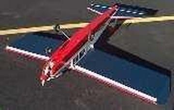
The same coloring rules apply to the fuselage. Keep the top of the fuselage light, and the bottom dark.
Photo 5.
The sides of the fuselage should aid you in flying horizontal passes. A solid color fuselage is very difficult to keep straight and level because all the aircraft reference lines are curved. Light blue and white fuselages ( a favorite ARF color scheme) blend in with the sky and clouds too well and will become invisible under some lighting conditions.
Draw a line along the thrust line of your aircraft, roughly splitting the top & bottom of the sides in half. Make the top half of your fuselage sides a light color. Make the bottom half a dark color, usually one of the wing pie slice colors.
Analyze how you fly. Beginners, and experts who fly inverted much of the time, should make the fuselage line color demarcation exactly follow the thrust line. Beginners fly airplanes with lifting flat bottom wings, so the aircraft fuselage side flies a straight line. The expert flies an airplane with symmetrical wings, so he flies in a slightly raised attitude to maintain level flight, whether upright or inverted.
Therefore he should also have the fuselage line color demarcation exactly following the thrust line, and when doing a horizontal pass he should maintain an equal rising thrust line sight picture whether upright or inverted.
The interesting situation is the beginning aerobatic pilot. His routines do not include horizontal inverted passes, but his maneuvers do include many horizontal flight components. He will usually be flying an aircraft with symmetrical airfoil wings, so the aircraft will be moving through the air with a slight upward orientation. He should offset the fuselage side color demarcation upwards at the tail of the aircraft, by about an inch. Now he can practice his horizontal passes by keeping the fuselage side lines parallel with flat ground.
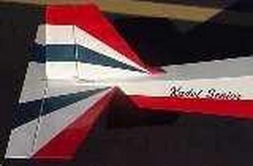
The vertical stabilizer and rudder should have very wide horizontal bands of color. Make the top of the horizontal stabilizer the same color as the wing tips. Then put a light colored band, and below this a dark colored band, usually the same color as the inner pie slice on the top of the wing. The base color of the vertical stabilizer and rudder should be the same light color of the wing.
Photo 6.
Another variant for the vertical stabilizer and rudder that works well on trainers with very big tails, such as the Kadet series, is a starburst pattern like on the top of the wing. This aids the beginner in determining the direction of travel when flying at a distance, when the tail starburst pattern becomes an arrowhead pointing out the direction of flight.
Photo 7.
Looping
Consider what the usual looping problem always is for the beginning aerobatic pilot. The pilot does not begin the loop with his wings flat, and corkscrews in or out. Proper coloring of his low wing or mid wing airplane can be a major help. Make the wing tips stand out. I usually make the outer 2" of each wing and 1" of each horizontal stabilizer the same bright red that I color the leading edge. If you follow my advise above on the wing bottom and the fuselage sides, the wing tip can be visually correctly placed for a perfect loop. If the wing tip is too high, resulting in a corkscrew out, the pilot will see the dark wing bottom. If the wing tip is too low, resulting in a corkscrew in, the pilot will find that the wing tip blends too well with the bottom of fuselage side. The correct sight picture will be the wing tip cleanly placed against the upper lightly colored fuselage side. Look at the IMAC or Pattern airplane pictures in R/C magazines. They always have a dark color on the top half of the fuselage side, into which the wing tip blends, causing looping problems.
Geometric Shapes
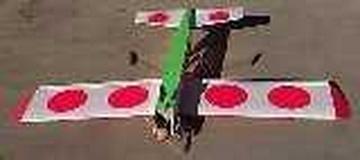
Humans can recognize different geometric shapes about 1/10th of a second faster than colors. I use this phenomenon to help me with the vertical rolls performed in advanced aerobatics. Instead of a solid dark color on the bottom of my wing & horizontal stabilizer, I put 4 large circles on the bottom of the wings and 2 large circles on the bottom of the horizontal stabilizer. The noticeably faster recognition of the round shape vs the line shape aids me in nailing the vertical rolls.
Photo 8.
A number of people at my field have copied my bottom circles without knowing the reason why I use them. The solid colored bottom is preferred unless you are doing vertical rolls.
Sunglasses
Several years ago I flew with some expensive Serengetti Driver sunglasses. These had a red tint to them, I guess to cut down on the ultraviolet region. I lost visual perception on a solid dark blue airplane during a landing approach and crashed. Fortunately they were stolen at a hobby store about a week later, and I got some RayBan aviator sunglasses with a blue-gray tint. What a difference!
Red is at the low frequency part of the visual spectrum, and blue is at the high frequency part of the spectrum. Red or Yellow tinted sunglasses reduce all colors to high contrast shades of gray, making your aircraft in the air appear completely different from the appearance of your aircraft at home or in the pits. Grey, light blue or light green tinted sunglasses make the airplane in the air look just like the plane in the pits, and because your vision is extended into the high frequency part of the visible spectrum, you will have twice the visual perception range!
Final Thoughts
> Evaluate color schemes for visibility first, beauty second. Dark colored airplanes are more difficult to see in overcast skies and in the evening.
> Scale planes are a special problem. War birds were colored to avoid detection, just the opposite of R/C planes. Avoid flying scale colored planes until you a very experienced flier.
> Avoid dark colors on the fuselage where your battery & receiver is located. The heat buildup can result in loss of battery capacity and premature radio failure.
> Don't fly when someone with a plane identical to yours is already flying. ARFs and yellow Cubs are particularly susceptible to this problem. Several years ago two fliers were flying with identical ARFs. When one of the models landed, both modelers went out to get the plane. Much to the entertainment of the folks in the pits, one modeler discovered the his plane had crashed out in the field 5 minutes previously because he had lost track of which airplane was his, and he was "flying" the wrong one.
---------------------
Dr. Robert Suding attended Sacred Heart Seminary (MI), received an MA from the University of Denver and PhD from Florida State University. He began his career teaching Latin but transitioned into a self-taught electrical engineer. Dr. Suding co-founded The Digital Group and invented one of the first desktop computers in the mid 1970's. He was known as a mad scientist passionately inventing anything for his hobbies, which included amateur radios, binocular telescopes, radio controlled model airplanes and pipe organs. Suding was the designer and manufacturer of the Ultimate Charger II. He passed in 2018.